The Best Fonts For Your Pinterest Pins
Bonus Material: PDF Cheat Sheet Of 144 Pinterest Friendly Fonts
This blog is for female small business owners who want to make their pins on Pinterest stand out more, whilst keeping the Pinterest algorithm happy.
Best Fonts To Use For Your Pinterest Pins
The best way to see if any font works well on a Pinterest pin, is to create that font on a pin.
Often when we see fonts recommended in other blogs and in other content, they’re shown grouped together on a non-pin image like this:
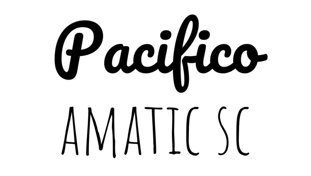
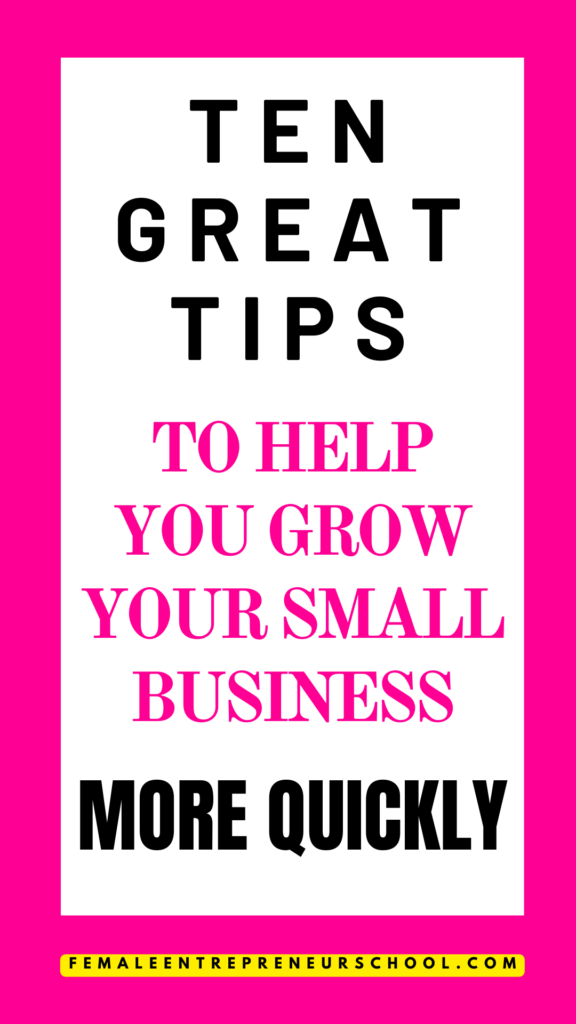
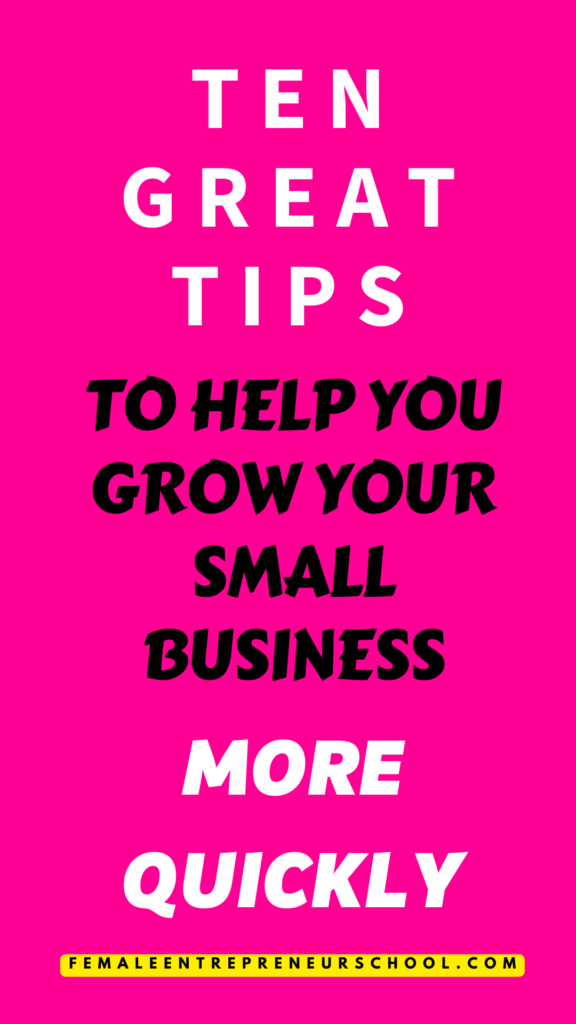
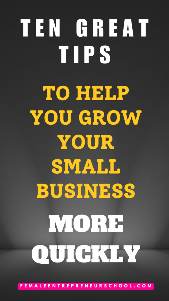
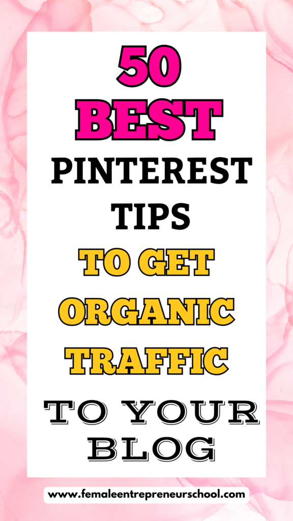
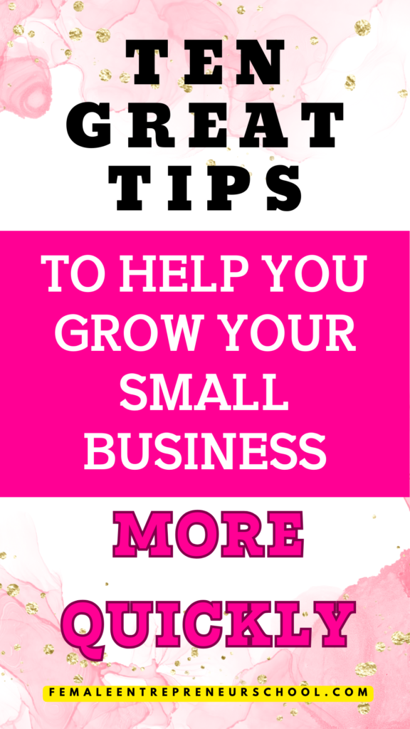
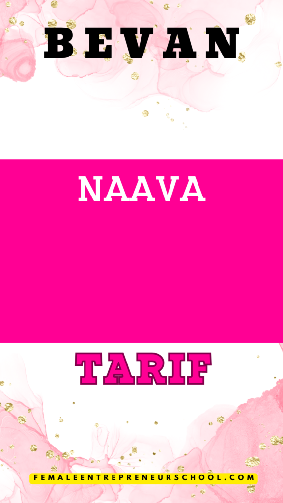
They can look fine when we see them in this format, but the fonts don’t always translate well over to Pinterest pins, as you can see in this image, where I’ve used the same fonts as in the image above (Pacifico + Amatic SC):
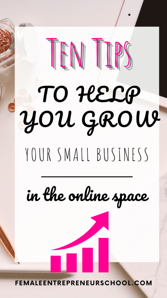
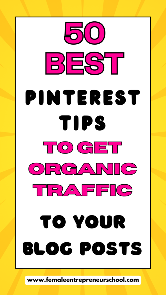
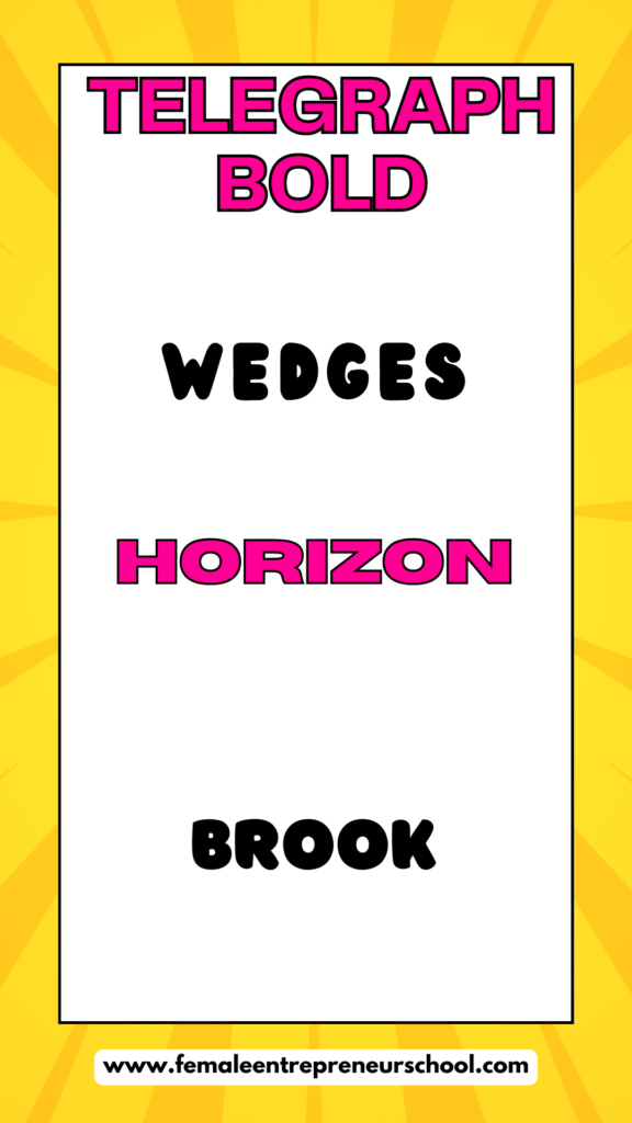
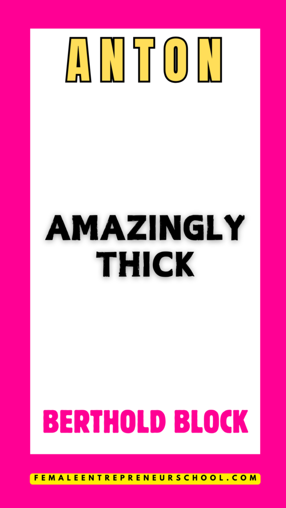
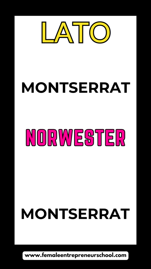
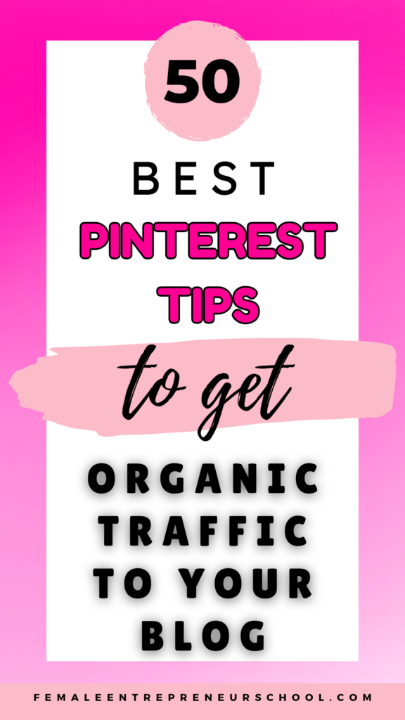
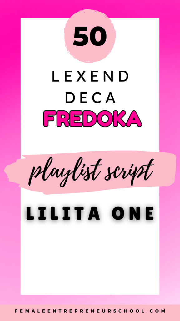
To help you see how the fonts I recommend actually work on pins, I’m showing you some of my favourite font effects on finished pins in the images below.
This will help give you a better idea about how well the fonts will work on a finished pin.
I’ve also provided some tips about creating great looking pins, using good Pinterest-friendly fonts, further down this blog post.
Best Pinterest Pin Fonts To Help Your Pins Stand Out
I generally use 2-4 fonts on each pin image, keeping the fonts nice, clean and simple, using a wide variety of my favorite font effects, to maximise the pin designs, and help them stand out in Pinterest’s home feed.
If you scroll further down, you’ll find a bonus video where I show you some font effects to help bring your pins to life even more.
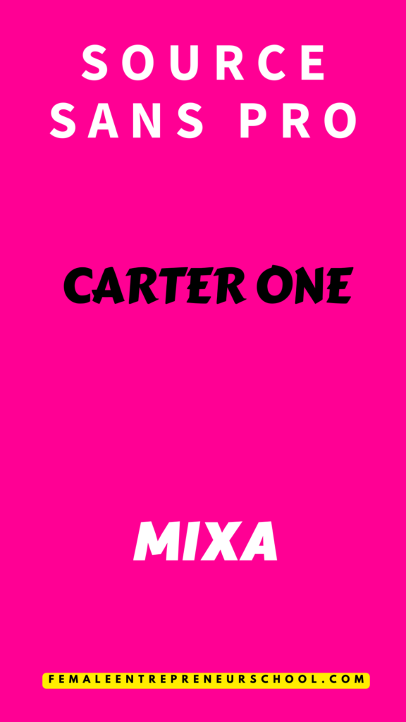
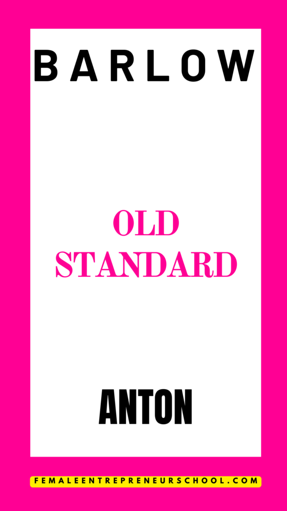
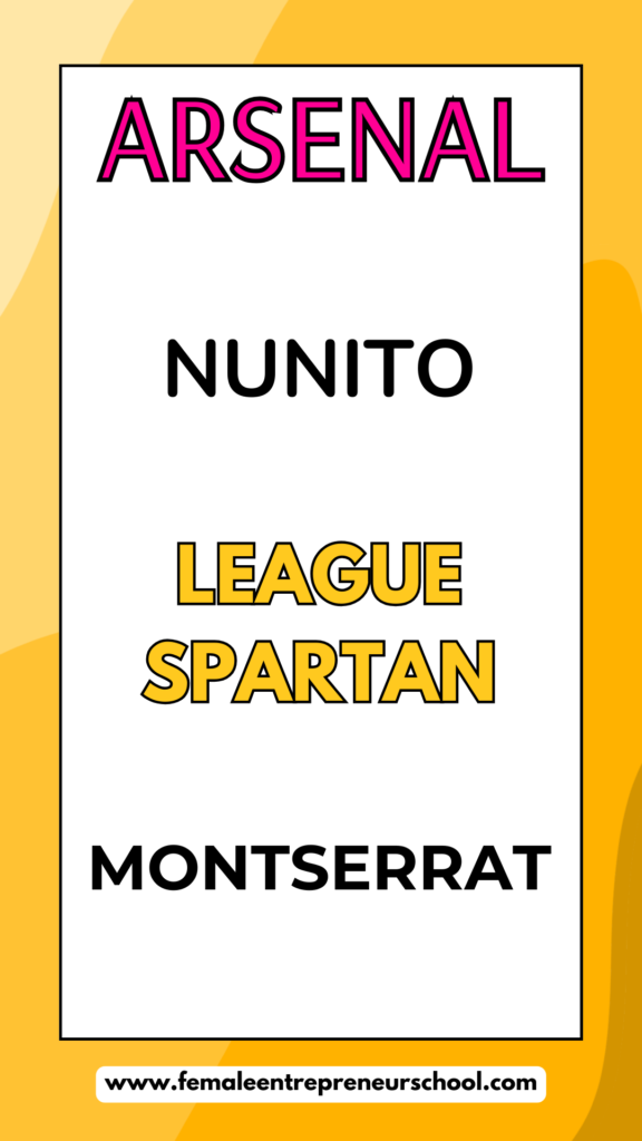
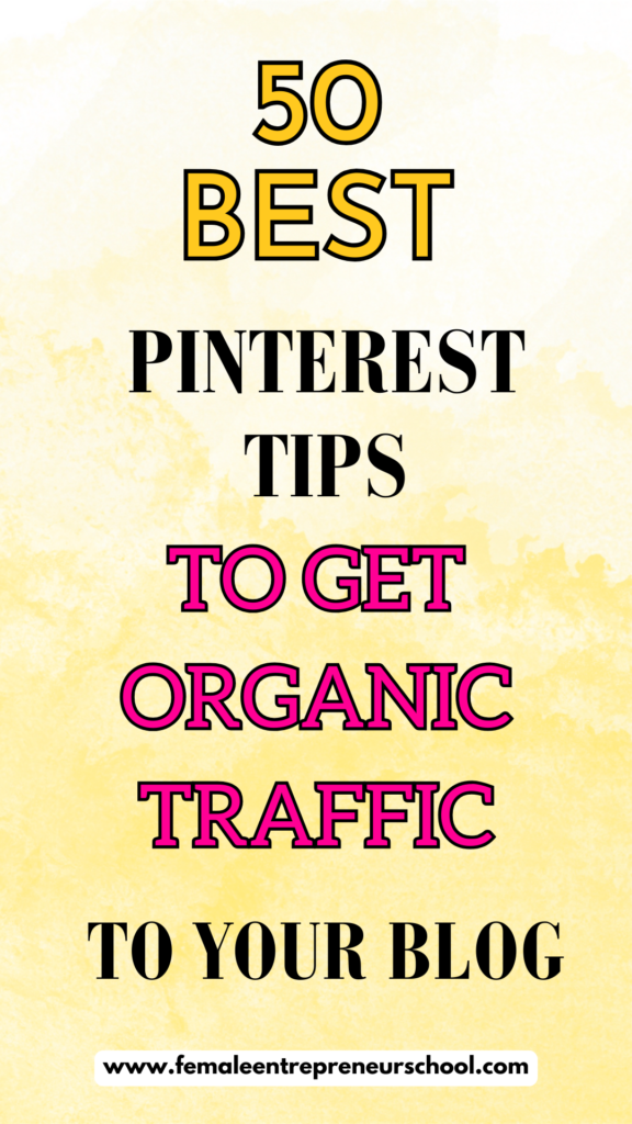
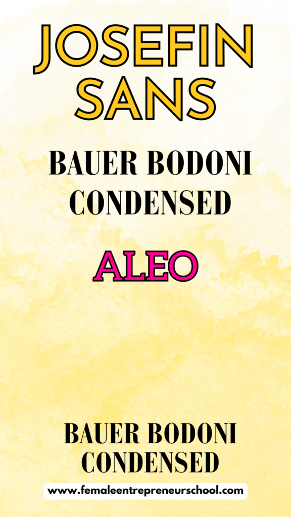
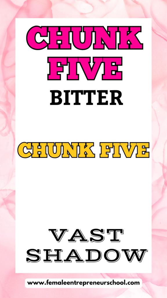
I’ve created two pins for each of the following designs – one showing a ‘finished’ pin version that I would use, and the pin next to it showing the name of each of the pin fonts used.
If you want really easy access to 144 great font designs for your Pinterest pins, simply go here and grab my cheat sheet.


Useful Tips For Fonts To Create Great Looking Stand Out Pins
- The types of fonts I recommend you use are all simple fonts that are easy to read. Often the simple font combinations are the ones that work best.
- You want to make sure your fonts are clean. Whilst handwritten fonts and script fonts can look pretty, the reality is that they can be very hard to read quickly when a Pinterest user is scrolling through the home feed on Pinterest.
- Whilst clean fonts like League Spartan or Glacial Indifference, or serif fonts can seem boring – these are my favorite fonts, because they have the ability to be read quickly and easily, so that the Pinterest user immediately gets a sense of what your pin is about.
- I use Canva pro for all my Pinterest pin designs. You will find thousands of canva fonts you can use on your pins to help make them look eye catching. Try searching for ‘thick’ or ‘bold’ or ‘heavy’ inside the font finder, to see choices for fonts that are easy to read fonts you can use. Or to make it easier finding fonts – grab my free cheat sheet of 144 Canva fonts you can use on any of your pin designs.
- Neutral fonts – those that are not over complicated can be your best friend when creating eye catching pins.
- With Canva Pro you have the ability to manipulate your fonts even further using the EFFECTS feature – I show you an example of this in the bonus video below. You also have access to more font styles with a Canva Pro account, but you can still create great looking Pinterest pins with a free Canva account.
- I often use 2-4 fonts on each of my pins to help create a better visual experience for those pins, using Canva font combinations that work well together – as show in the image examples above. I don’t believe using a variety of fonts will negatively impact your pins – in fact I see better results when I do use more than one font on each pin design.
- If you’re going to use fancy fonts such as handwriting fonts, or italic fonts – be sure to use those for text that is ‘add on text’ that gives more information on the pin, rather than using these fancy fonts for the main pin title.
- You can improve the visuals of your pins by increasing spacing between letters, but make sure your letter spacing still enables the pin font to flow and look appealing. I share an example of how to do this in the bonus video.
- Whilst I use Canva as a graphic design tool for all of my pins, there are other options available to you. PicMonkey is also a popular graphic design tool many Pinterest users create their pins with.
- You can make your pins stand out by using different colors for fonts you use. I use brand colours of pink, black and yellow on all of my pins. These colors are bold and stand out. Wishy washy pale colors do not stand out as well in the home feed of Pinterest.
- If you use any font that looks a little weak visually, try using the bold typeface to make it stand out. This can often take a weak looking font to a bold font.
- When you’re creating Pinterest pins as part of your content creation strategy, simple is always best – and that includes using simple fonts on your pin image.
- If you’re creating Pinterest pins for blog traffic, be sure to add some of your Pinterest pins to your blog posts, so that people can pin those pins to their Pinterest accounts.
- Remember you’re trying to use an interesting, attention-grabbing title on your pins, to help those pins catch the eye on your audience. Even the best fonts will not cause people to click or save your pins, if the pin title does not resonate well with them.
- Your background image or any image on any pin for that matter, should not take away from the text on your pins. Even though your image needs to be good and visually appealing, your text and the fonts you use should stand out enough, to really help people make the decision to click through to see more.
- Incredible pin titles are best formed from the right keywords that relate to the topics your audience are inside Pinterest searching for. It’s best to create your content and your pins around Pinterest friendly topics, and then use great fonts in vibrant colors, or good color combinations that are your branding colors, to maximise the chances that your pins are the ones people want to engage with.
Bonus Material: 144 Pinterest Friendly Fonts Cheat Sheet
Related Posts
Why Your Pinterest Traffic Is Dropping And What You Can Do About This
11 Tips To Help You Rank Higher On Pinterest